Editor’s note: This text is edited from its original version to fit this space. Visit the Program on Dairy Markets and Policy website to read the paper in its entirety. This article summarizes and discusses information the USDA has released about enrollment in the Margin Protection Program for Dairy Producers (MPP-Dairy).

MPP-Dairy was created by the Agricultural Act of 2014. The general design of this new program is to give dairy farmers the opportunity to protect against low incomes from the sale of milk relative to the cost of feeds used for the dairy herd – hence, margin protection.
The specific margin that actuates the program and determines benefit triggers is a national benchmark called the Actual Dairy Producer Margin (ADPM). An individual farm’s actual income over feed cost is irrelevant to the operation of MPP-Dairy.
Farmers must establish their eligibility and a historic level of milk sales that will define how much milk sales they can cover over the five-year life of the program. Every year, they are able to decide how much margin coverage they want for the coming year in terms of the percentage of their historic milk sales and the magnitude of the margin, both within ranges allowed by law.
Catastrophic coverage at $4 per hundredweight (cwt) can be obtained without any premium above the $100 annual administrative fee paid by all participating operations. Farmers can buy higher levels of coverage in $0.50 increments up to $8 per cwt, which is just below the average since 2000.
At each incremental increase, farmers will have to pay a higher premium. There are two tiers of premiums, with a fairly significant increase in costs for milk enrolled in excess of 4 million pounds per operation per year. For 2014 and 2015, Tier 1 premiums for enrollments up to 4 million pounds were further discounted 25 percent.
U.S. dairy farmers were allowed to establish their eligibility and select coverage levels for the 2014 and 2015 program years during the period Sept. 2 to Dec. 19, 2014. The Farm Service Agency of the USDA recently released summary statistics describing the enrollment results by state. This article describes and discusses these results.
The current information is very limited and probably stimulates more questions than it provides answers. At the risk of squeezing out more insight than these simple data contain at this point, we speculate on some possible explanations for enrollment patterns. Our purpose is more to frame questions and hypotheses we hope can be explored more rigorously when more detailed enrollment information is available.
Total farm participation by state
The USDA knows how many farmers elected coverage for the 2015 program year; however, the released data did not report that specific number. Instead, the USDA presented enrollments as a percentage of the number of licensed herds reported by the National Agricultural Statistics Service (NASS) for 2013.
This is one of several variables the NASS reports that indicates the number of dairy farms. This particular variable is well-chosen by the FSA insofar as it is a count of the number of distinct operations in the U.S. licensed to sell milk commercially.
Inasmuch as a dairy operation must be actively engaged in the sale of milk or products derived from their own farm milk to be eligible for MPP-Dairy, this standard measure of the number of dairy farms is most likely to correspond to the actual number of dairy operations that are in fact eligible to participate.
Nevertheless, it is well to keep in mind that ownership patterns, commercial licensing and the number of bulk tank locations for a large operation can make counting operations or licensed herds a bit trickier than it sounds. Thus, there is no doubt some discrepancy between the NASS variable and the number of operations the FSA would consider being eligible.
For the U.S. as a whole, enrollments equaled 51 percent of the number of licensed herds in 2013 or 23,807 dairy farms. This number is about one-third lower than the 35,411 dairy farms participating in the Milk Income Loss Contract (MILC) in fiscal year 2013.
The simple average percentage of enrollments for all states is 58 percent. The fact that the average of individual states is higher than the national average suggests that enrollments tend to be relatively higher in states with lower farm numbers. Indeed, there is a modest but negative correlation (-0.18) between the number of farms in a state and the enrollment percentage.
An example of this pattern is the fact that Pennsylvania, New York and Ohio had relative enrollments lower than the national average. Wisconsin, the only state with more farms than Pennsylvania, had a relative enrollment very near the national average percentage.
There is insufficient information to conclude that the number of farms in a state explains anything about farmer choices, but perhaps this is correlated more with farm size, or more specifically the number of small farms.
A simple statistical analysis of the data supports the hypothesis that states with higher average farm size had a higher percentage of farms enroll (correlation coefficient: 0.35). The extent to which the range of farm sizes influenced participation will be clearer when there is more data about individual enrollments.
The median enrollment for all states is 62 percent. In other words, half of the states had enrollments of 62 percent or more, while the other half had lower relative enrollments. This indicates that more states had enrollments above the national average. Enrollments in MPP-Dairy for 2015 coverage are illustrated as a map in Figure 1 by state, expressed as a percentage of licensed dairy herds in 2013.
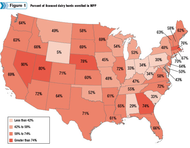
It warrants noting that the breakpoints in the shading are intended to differentiate the unusually high and low, as noted earlier. The other 38 are simply divided between those above the average percentage for states and those below.
The map suggests that high- and low-participating states exist in every region. Especially low and lower-than-average states occur more frequently in the eastern half of the U.S. and include such prominent dairy states as Pennsylvania, Ohio and Indiana, as well as other states ranging from northwestern Appalachia through the Corn Belt to the Great Lakes.
Clearly this is an area of the country that tends to have lower average farm size and rely more heavily on home-grown feeds. Several of these states also have significant Amish and Mennonite populations, cultural groups that often eschew public assistance and government programs generally.
The highest-participating states also span the U.S. As noted earlier, the number of farms in Nevada is quite low, so a few enrollments more or less can make a large difference in percentages. However, the other high sign-up states have herd numbers of 200 plus or minus.
These states cannot be so easily dismissed as a statistical anomaly. Higher-than-average participation exists in every region but tends to be more prevalent in the western half of the U.S.
The largest milk-producing states have enrollments within the middle span, but there is no common tendency. The major state having the lowest percentage enrollment is Pennsylvania at 30 percent. The highest, at 70 percent, is Texas.
Margin coverage election choices
Farmers could choose nine levels of margin coverage ranging from the so-called catastrophic coverage at $4 per cwt to as much as $8 per cwt in increments of $0.50. The USDA has not yet reported the enrollments at each level, but they have reported relative enrollments for catastrophic coverage versus any level higher, the so-called buy-up levels.
Figure 2maps the percentage of all farmers who elected buy-up coverage by state. States in the western half tended to have higher participation rates in MPP-Dairy, but those who did enroll in the eastern states were more likely to choose higher coverage levels. Conversely, many of the enrollees in the western states chose catastrophic coverage.
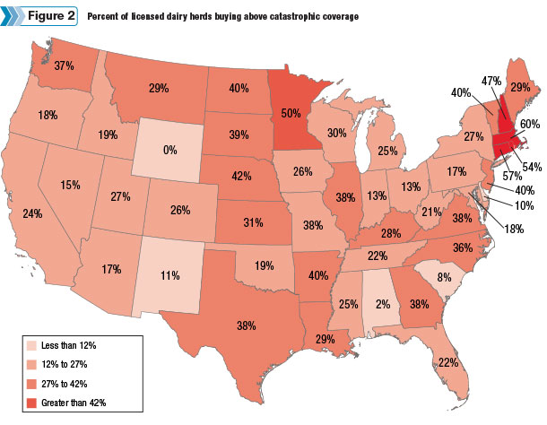
As before, a handful of states on either end of the spectrum arguably represent groups with distinctly high or low preferences for coverage above the catastrophic level. Of course, these data do not indicate whether an operation selected $4.50 or $8 or some level in between.
Hence, it probably strains the data to say too much about how aggressively one group of farmers used MPP-Dairy versus another. Anecdotal information suggests that mid-range choices of $6 or $6.50 were popular, but until there is more detailed information, one should be cautious before interpreting implications about the reported levels of buy-up coverage by state.
Nationally, the number of dairy farms purchasing buy-up coverage is 13,091, or 28 percent of the total number of licensed dairy herds.
States who fall at the top of this measure include Massachusetts, Connecticut, Rhode Island, New Hampshire and Minnesota. Thus, the New England states, with the notable exception of its most prominent component – Vermont – stand out in the U.S. as states where participation was what one might call aggressive. Vermont is in a second tier of aggressive participation, while Maine and New York are more near the national average.
At the other end of the spectrum, states whose farmers showed the most tepid interest in MPP-Dairy might be identified as Wyoming (which is in a class by itself) and Alabama. The next group of states has significantly higher participation rates than these two states but also stand out as next most passive in their interest in MPP-Dairy. These are Hawaii, South Carolina, Alaska, Delaware, Ohio and Indiana.
It will be interesting to get more information to help understand the low participation rates in Ohio and Indiana, both of which have considerable milk production. As noted earlier, both states have fairly large populations of Amish or Mennonite communities, which may explain the combination of lower sign-up rates and more tepid participation.
Rounding out that Mideastern set of states, Pennsylvania and Maryland are in the next group of states with more passive coverage decisions, along with a number of others distributed around the U.S.
It is perhaps a curiosity and surely something that warrants a good deal more information before any strong conclusions could be drawn, but it is interesting that New England seems to include many of the states we might characterize as having aggressive participation while the neighboring Mideastern states from Pennsylvania to Indiana are among the most passive.
This may point to culture or attitudes being an especially important determinant of participation, as opposed to the more cut-and-dried matter of production styles or farm size.
Comments and conclusions
As is often the case with just a little bit of data, these summary statistics raise at least as many questions as they answer. These include a number of questions for which the answers have importance for outcomes such as the degree of overall farm-level margin protection, price impacts of MPP-D and government expenditures.
Sometimes when analysts try too hard to extract information from a limited dataset, they are accused of “torturing” the data. At the risk of doing just that, the patterns of the summary enrollment data suggest support for these hypotheses.
1.Attitudes may have played an important role in determining whether or not a farmer enrolled in MPP-Dairy.
2.Attitudes probably had less of an effect on coverage election.
3.Although it is not something that can be deduced from the USDA enrollment data, anecdotal information suggests that educational and/or promotional levels may have had a positive impact on enrollment and even more so on the selection of higher levels of coverage.
Educational activities would be those that explain how the program works and how farmers might use it, as different from promotional activities designed more to simply increase awareness and encourage participation.
4.Farmers who rely heavily on purchased feed were more likely to enroll but also more likely to limit themselves to catastrophic coverage. This is not directly observed from the summary enrollment data, but it is suggested by the pattern of higher enrollments in western states.
Again, we caution against torturing the data and coming to conclusions about what factors influenced farmer participation decisions before we know much more about the enrollment and how the year plays out.
Nevertheless, these sorts of insights and hypotheses will be valuable to explore as the nation’s dairy farmers come to the 2016 enrollment period, which begins in July, and as policy-makers begin to evaluate how well MPP-Dairy is meeting its goals. PD
Andrew M. Novakovic is the E.V. Baker Professor of Agricultural Economics in the Charles H. Dyson School of Applied Economics and Management at Cornell University. Marin Bozic is an assistant professor in the Department of Applied Economics at the University of Minnesota. Mark W. Stephenson is director of Dairy Policy Analysis at the University of Wisconsin. Christopher Wolf is a professor in the Department of Agricultural Economics at Michigan State University. Charles Nicholson is a clinical associate professor in the Smeal College of Business at Penn State University. John Newton is a clinical assistant professor at the University of Illinois.
References omitted due to spacebut are available upon request. Click here to email an editor.

Marin Bozic
Assistant Professor
University of Minnesota


